What makes a portfolio stand out? How does it stick around for more exposure time? Why is workplace diversity such a difficult issue to tackle?
Glad you asked.
We’re going to talk about the first two questions (the third one I’ll leave for later).
When you want to make a portfolio you can make a website from scratch to best showcase your work. Or you can just grab something easy like WordPress and feed it with your work. Or you could design a PDF portfolio.
When faced with so many difficult choices, how do you know which one to pick? Well…
You should pick a WordPress theme
Look.
You can spend a good amount of time thinking, designing, and coding a website that has all the bells and whistles modern browsers support. This just goes to show how an efficient, elegant coder/designer you are. Congratulations. First impressions are really important, and your website is doing an excellent job at it.
Your custom built, spotless and divine portfolio site is also best at something else.
It’s best at sucking up your time.
I am in no position to stop you for spending copious amounts of time on a custom site. It’ll surely delight people who see it and perhaps truly be the reason you got the job. I just have an issue with the “perhaps” part in that last sentence.
If it’s going to take you days to make it, just so it appears nowhere, on no award site, without any reasonable returns on your blood, sweat and tears, then… don’t make on. If it’s going to take you forever to create a new site every time you finish a couple of projects, then… don’t make one. If you like to rub your ego the right way, and have a good chance of impressing someone with a website, then… OK, make one.
Your portfolio site should fade into the background. It should strive to NOT be an interface at all. Because the most important thing is your content: the work you do, and the work you did.
It’s dead simple; updated regularly; made by people for people; open-source and FREE. It works mostly like a blog engine. You put in pictures and text and then it displays them. But instead of writing “posts” you can just imagine it says “projects” and fill pages with your work.
If you need to update your portfolio or edit something, it’s as quick as editing a Facebook post. A total no-hassle dream.
Not all WordPress sites look the same. They use themes to look pretty. There are free themes, and then there are paid themes.
*By an almost freakishly weird coincidence, all free themes are shit.*
Don’t be cheap and cash out on a simple portfolio theme. It needs to one that blends into the background. Something that makes the viewer empathise and follow your work without distraction.
Anyway, the mechanism with which your work is delivered should almost not exist in the eyes of the viewer. It should follow the words of religious philosopher Simone Weil when she opined on her idea of self-erasure:
“If only I could see a landscape as it is when I am not there.”
I’m sorry where were we? Ah yes, themes. Here’s a few recommended portfolio themes for WordPress that try to be there as little as possible, all the while featuring your work in the best light.
Collecto
Collecto is a fantastic porftolio theme. It’s a grid based theme inspired by magazines and newspapers. It’s elegant, minimal, and contemporary.
Unid
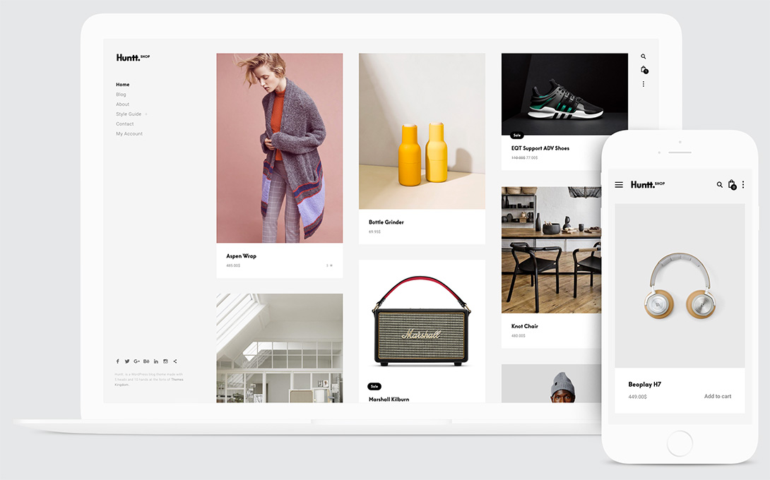
Unid is our best selling ecommerce theme. But! It has a portfolio feature built in, so you can use it to not only showcase your work, but also let people buy your stuff directly from your website thanks to the WooCommerce plugin.
Eris
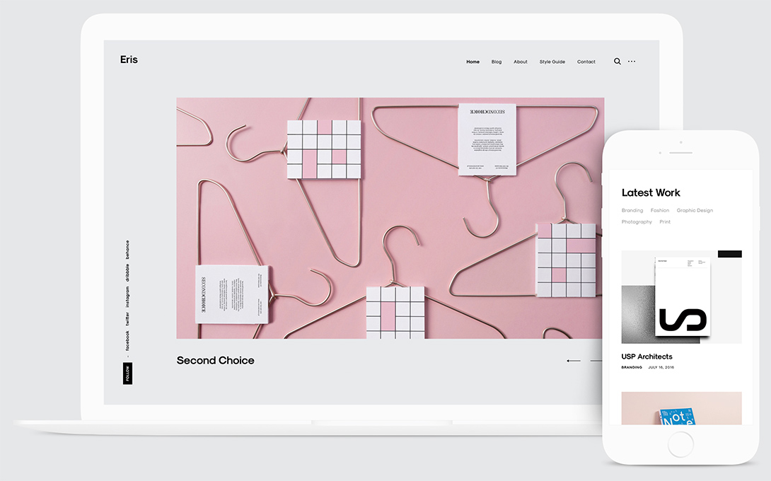
Eris, the goddes of chaos and discord, was the main inspiration behind this theme. It takes your work – however chaotic it may be – and creates an orderly website out of it. It’s really good at featuring an eclectic body of work – so if you make a bunch of different stuff, Eris will make it all work together.
Student discount – 50% Off
If you’re a student, you’re eligible for a 50% discount. Just fill out this form and get your discount!


