Running a charity has its rewards. Running a charity’s website, however, is similar to running a hospital on fire and pretending that everything’s fine.
The web admin of any charity, big or small, is usually just a kind employee or volunteer who’s in charge of the charity’s site. If large sums of money are involved, the site maybe be an overproduced mess used to burn through pockets quickly and mercilessly. What’s left is a website made from the worst kind of spaghetti code dating from 2009 that barely chugs along. It’s slow, challenging to use, hard to manage, and heaven forbid a smart teenager somewhere has enough free time to waste on hacking the site.
The cold, hard truth is: there’s always a bored, smart teenager out there, somewhere.
What most NGO sites are left with is an undefendable mess of bad copy written by people who really had the best intentions but only know how to write project proposals. Add some poor choices in stock photography that are gracelessly inserted at any at every given moment. Top it off with poor links, without any call to action buttons; vague words about changing the world; and voilà! You’ve got a basic, off the mill NGO/charity website.
This hurts the charity in a multitude of ways. Bounce rates are high. Donations are low. People mistrust the organisation. These reasons are just a few of the worst offenders that cause the greatest damage to any non-profit.
There is a way around this. It entails having patience and truly committing to a website. Whether you’re just starting out, or someone gave you the reigns to their site, or you are the long standing web manager at a charity in dire need of help, you can affect change. You can whip the website into shape so it gains trust, and garners more donations without losing your mind. You don’t have to conduct complicated A/B tests, or spend thousands on a Google App integration, or any other unnecessary buzzword that’s floating around these days.
What makes a WordPress theme so great for charity sites?
Custom built sites are exorbitantly expensive. Quotes vary by country, where the west sees figures ranging from 5000$ to even 50,000$. Nonprofits simply should not invest so much in a site, no matter their size. A better solution would be a premium quality theme. The best part is that such finely crafted premium WordPress themes are now within reach for anyone. They’re cost-effective, to use the corporate term, and are a true example of the 20/80 rule. In the long run they’re cheaper to maintain, especially considering that a custom site would require custom support which again means thousands of dollars being paid to a web studio.
Almost all custom themes have flexible designs. This means you can mould them to your heart’s and your organisation’s content. You can do much of the “heavy lifting” yourself, because the heavy in that lifting isn’t heavy at all. If you really need any outrageously custom pieces, you could hire a web designer to do it for you quickly. Even that option is cheaper than a full custom site.
Don’t mistake changing the site’s features with changing the site’s content. If you’re even mildly computer proficient, you’ll be able to change photos, write news, and manage the entire content of a themed website on your own. Thus, no need to call – and pay – just to have a new piece of news strung up on your site. You can even change some of the basic colours and functionalities of a theme by yourself, too.
Here’s a few of our fave new premium WordPress themes we’d recommend for using with WordPress for charities:
Collecto
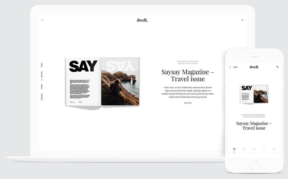
Collecto was made as a magazine theme, yes. But you can quickly and effortlessly turn it into a charity site. Use its portfolio feature to highlight any causes you fight dearly for. You can use portfolio pages to write more about your cause. Use standard blog posts to write about your progress and events. Use powerfull images from unsplash.com because Collecto was made to pair text well with images. You’ll love its off-screen sidebar and article page design.
Phenomena
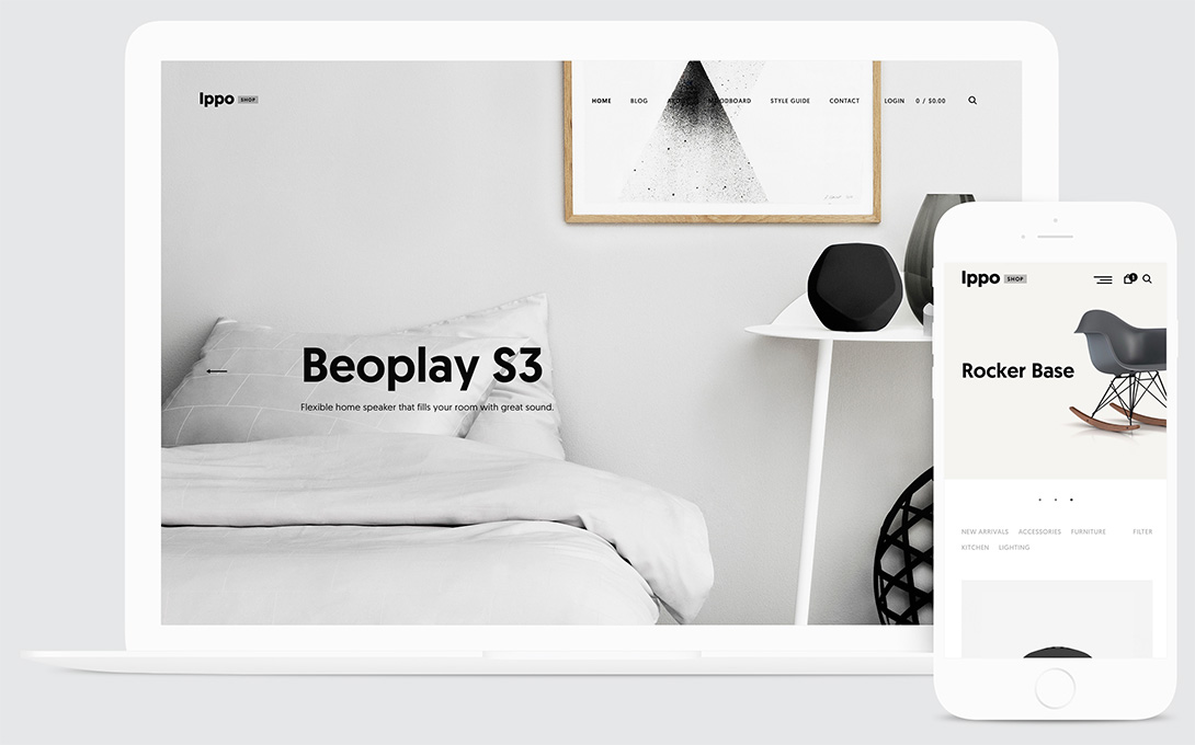
The same story goes for Phenomena. You can use the portfolio feature to highlight your cause. But there’s an added bonus: Phenomena is fully compatible with WooCommerce, which is a payment system that can handle donations. This is great if you need a prominent way to ask for donations.
Veni
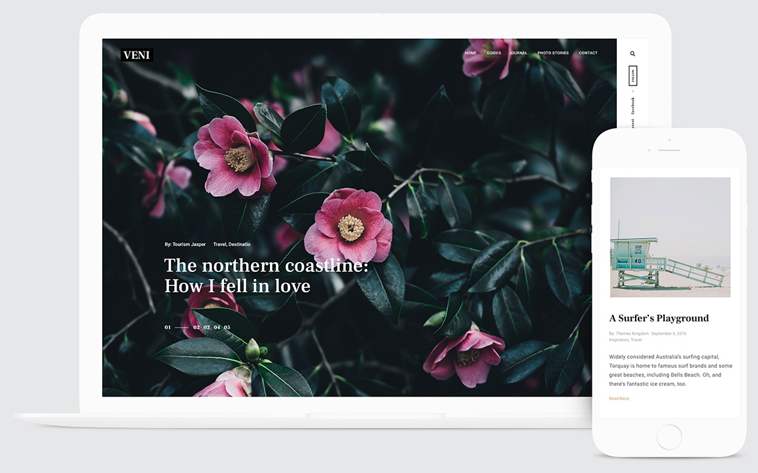
Veni is pretty big on pictures, which is a great storytelling tool for non-profits. You can use its portfolio feature the same way with Collecto and Phenomena, but its biggest strengths lie in its fantastic slider, and neat post archive page. Oh yeah, Veni support WooCommerce, too.
Help! I don’t know how to install a WordPress Theme
No worries. There’s plenty of free tutorials online if you feel adventurous and want to learn how to do it. But the fastest and easiest way is to get Themes Kingdom Managed. It’s our new service where we install WordPress, install a theme for you and give yuo the keys. We protect and make backups of your website as well.
All that you have to do is focus on the stuff you’ll put on your site. Writing great content and taking care of your site’s copy is THE most important work you can invest in. It is directly related to how people perceive your organisation. Fantastic copy makes building trust with your visitors seem effortlessly easy. But it takes a lot of hard work and lots of revision to get it right.
The second important line of work is to build a robust website that’s easy to read (for your visitors), easy to manage (for you), fast and responsive. Our themes will help you with “fast, responsive, and easy to read” and WordPress will help you with management.
Get 50% Off
You can get 50% off on all our WordPress themes! Just fill out this form for non-profits and charities and you’ll get your discount!


